The Web Design of the Business Logo and Branding
Presentation of the steps in creating the logo and branding of W+M Services. Tips and references for your professional and business image.
Hello,
Several weeks ago, I was jealously watching my competitors’ social media, checking their brand image and logo. Yes, when designing the new W+M website released last month, the time came to choose the new colours and lettering and, at the same time, to question the importance of having a logo for the company.
Often being among the first elements visitor sees when consulting a business profile on the web, or in a poster in the front of a store, a logo often helps us to locate the restaurant we are looking for in the car while driving or to identify a sponsor on a hockey ice.
Of course you need a logo for a business. Is it complicated to do? Do you have to put it on paper and physical documents? It’s going to take a long time! These are the questions I asked myself while looking at the beautiful logos of local businesses. This article explains the steps involved in making the W+M logo and finally, it’s not complicated at all when you prepare in advance!
In this report:
Explore the inspirations and values that shaped the creation of a professional logo designed to convey clarity, warmth, and trust.
See the full design process step by step, from concept sketches to the final logo used across the website and social media.
Get inspired to define or refine your brand image through a real, relatable example.
MusicScore: As I was listening to old classic house mixes from the ’90s while writing this paper, I propose to listen to this while reading: Keep Pushing from DJ Boris Dlugosch. Did you dance on this too? I was a king!
Listen to the MusicScores complete list on YouTube! Enjoy the Music At Work!


My Logo Designs Step
After several readings of articles on the subject, I leave the best ones linked in the Sources section at the bottom, most mention the same things about the design and the layout of a logo. There are, however, things to know that will help the creation process to prepare in advance.
The Choice of Colours
The choice of the colour(s) is, in my opinion, the first thing to decide for the branding of a company, since they will be used everywhere in the process of putting your identity online. It is also good to know the reference numbers of your colours for graphic designers and printers.
Certainly, the more colour we take in a logo, the higher the printing price will be. In addition, I think it is important to read about the meaning of colours and the feelings they give off, both for visitors and workers, to choose the right colours. Here is an article about The signification of colours that might be helpful. It is a French paper from Graphiste.com, so use the translation function of your browser.
Here are the five colors used for the W+M Services website and logo prints.
To help you find your colour numbers, here’s a conversion tool I use from rapidtables.com.
The colours of the images above are those of the W+M website. The colour of the raspberry header banner matches the blue grey of the options and buttons and the grey of the footer. RGB numbers (measuring the intensity of red, green, and blue) are often used for digital tools for the web and small images. Other types of colour coding exist for physical or other print formats.
Lettering and Fonts
Like the colours, the choice of the lettering is large. It is good to know the name of the fonts used for your logo, which will usually be harmonized with the lettering of your website, if applicable. I never choose more than two fonts personally in a branding or a logo, and I try to separate the letters on the logo, so everything is clear and neat, no matter how big the logo is printed.
I try to print the logo as a test on an envelope as well as postal size image on paper. Printing on an envelope and verifying the signature of an email from a mobile phone are usually my ultimate tests. If the logo and lettering are readable in both physical and virtual versions, usually there will look OK on larger dimensions and on all devices.
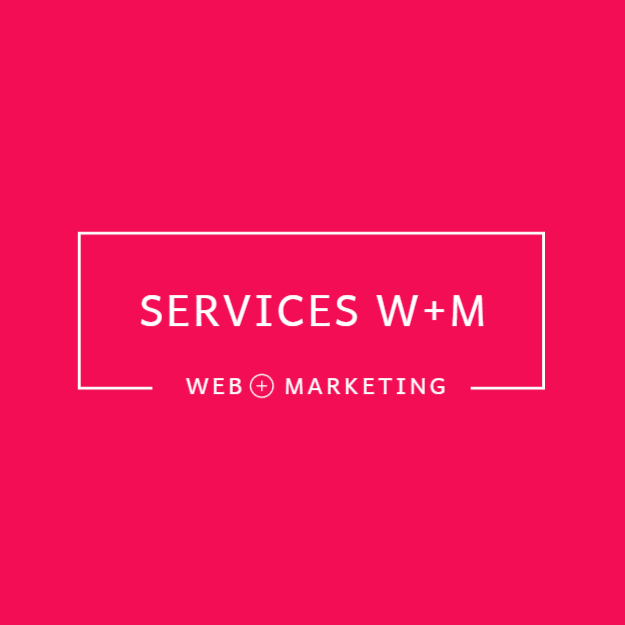
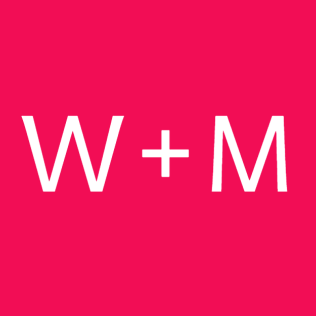
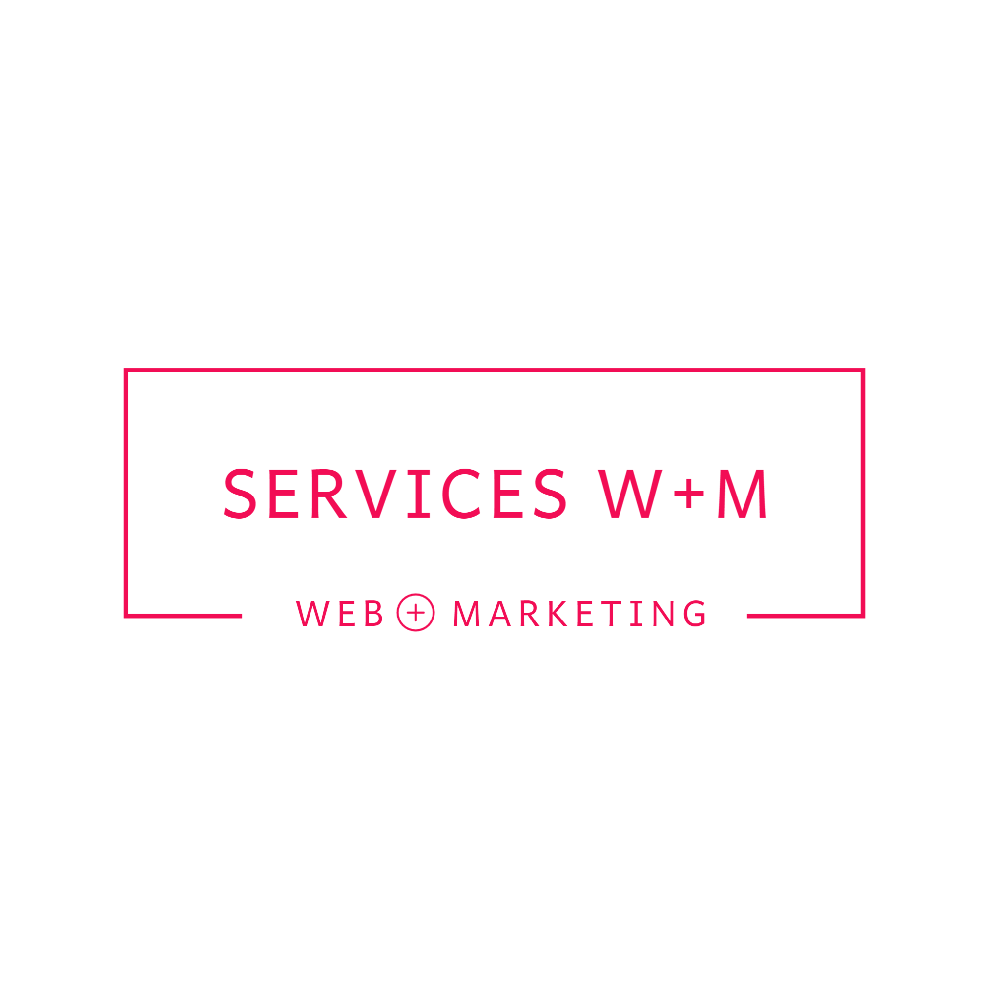
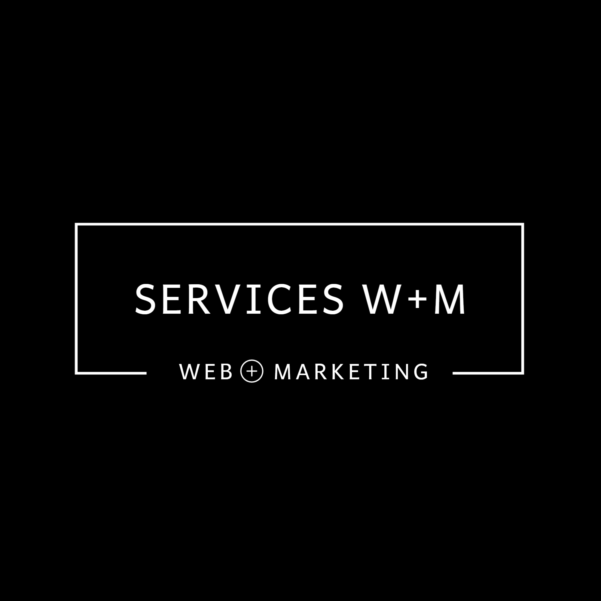
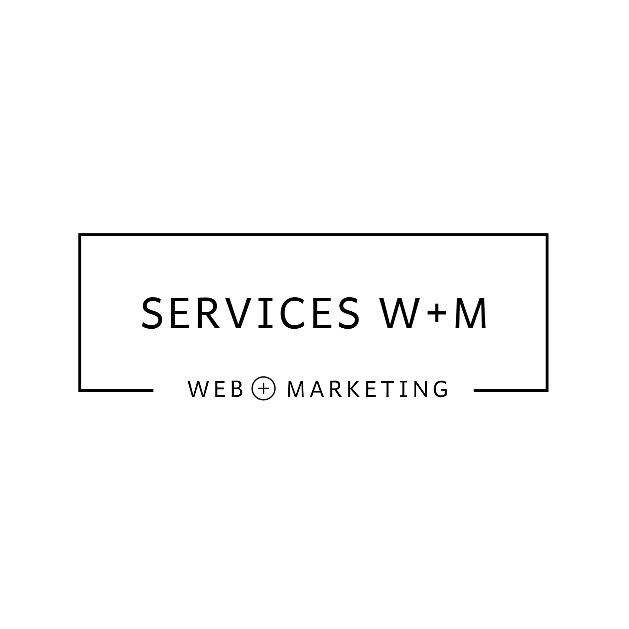
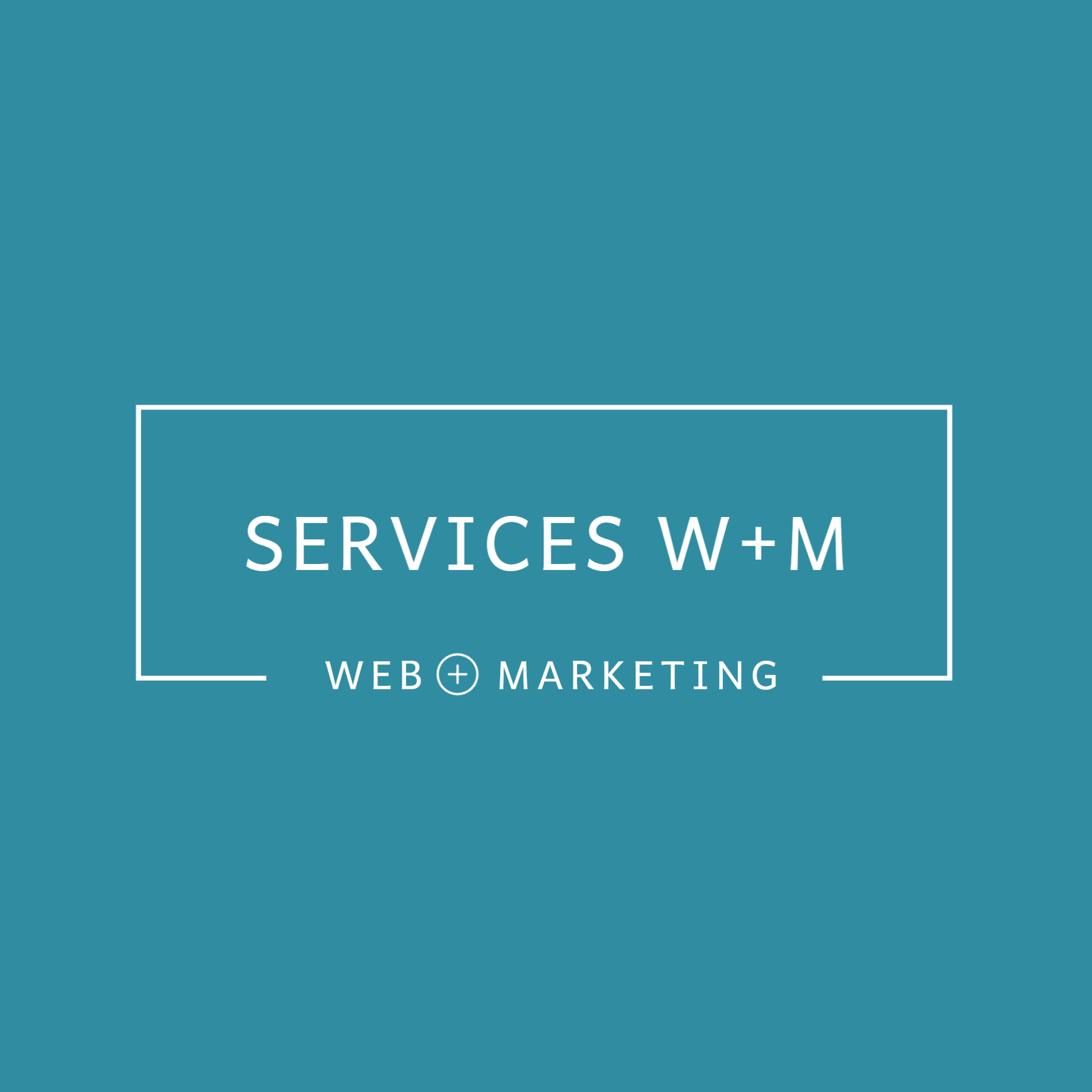
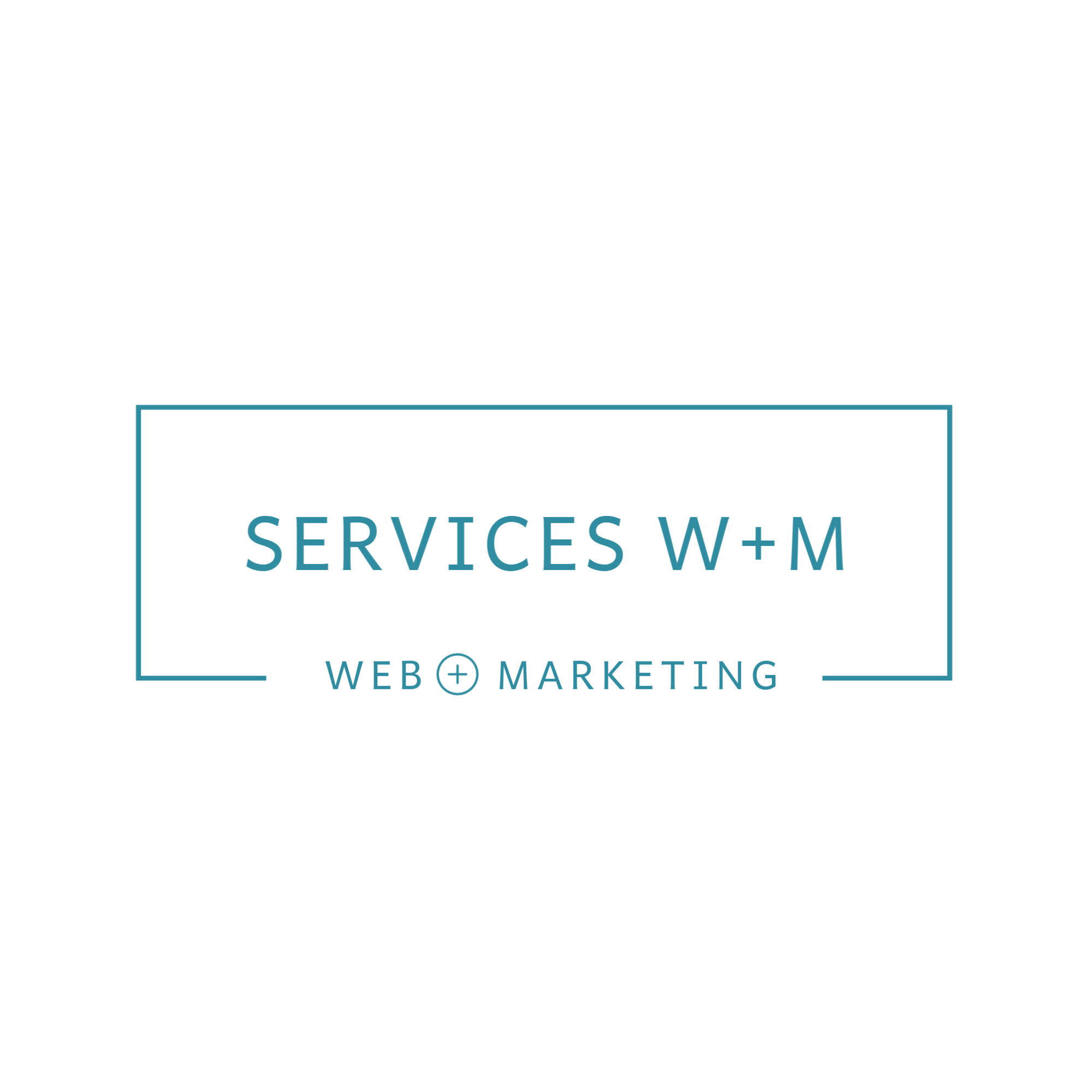
Introducing the W+M Logo Gallery
Here, presented for the first time for the publication of this article, are the W+M logos with the new brand image colours. Note the black/white versions, often requested by editing media according to their display standards, and a version with the secondary colour, which is not mandatory, but optional and personal when working with red and green, for colourblind people who will prefer to wear the secondary colour.
Identify where your logo will be displayed!
It’s important to have an idea of where our logo will be displayed. A Store Panel requires more organization than a single web image.
Here is a list of the display of the W+M logo to give you an idea:
Square and rectangle website images with no background colour
Square and rectangle website images with background colour and white writing.
Image with coloured background for social media profiles (Facebook, Instagram, Threads, X, LinkedIn, TikTok, YouTube)
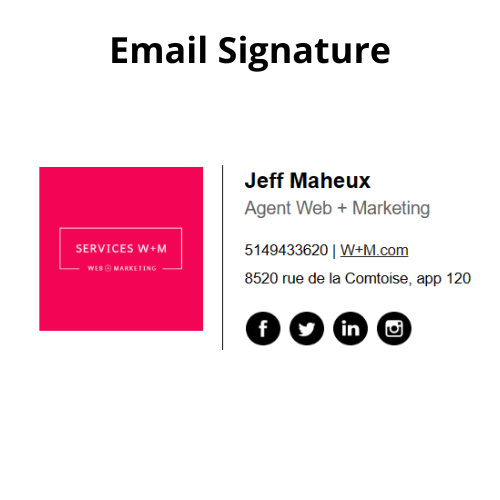
Image for email signature
Image for Favicon web icon
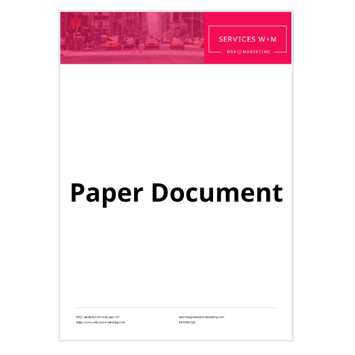
Image for printed documents with the company name and address (sheet and envelope)
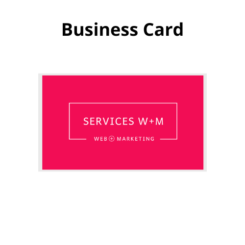
Business Cards and Countertop Frame
Invoice Item (Estimate Document, Contract, Job Sheet, etc.)
Plan the banners too
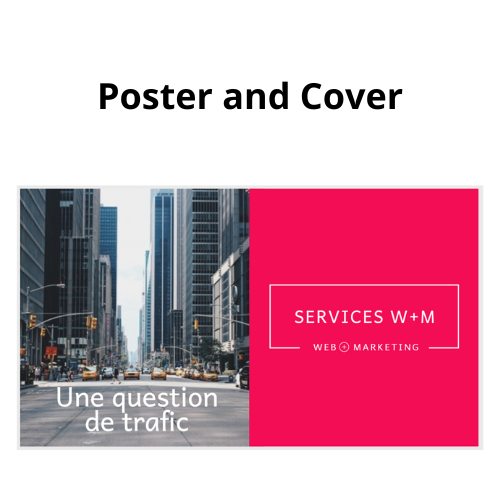
And since we’re in the process of establishing the visual list, why not also establish the promo visuals that will carry the logos and prepare everything at the same time, saving time and cost.
Here is the list of W+M banners, to give you an idea. Please note that W+M does not print physical office signs and does not have a storefront banner.
Homepage web banner, English and French
Subscription incentive banner, English and French
Page banner of social media accounts (Facebook, LinkedIn, X, YouTube)
Header and footer banner of the email sent to members

Tricks and tip: keep your visual details. Why am I making these lists? And without wanting to discourage you in establishing your first logo, it often happens that a company changes its logo in its history, in addition to mentions, such as adding the number 20 to the existing logo in the year of a 20th anniversary of the company, for example.
Our list will be useful and reliable for each request to change the design to be sent to a graphic designer. Also keep a copy of your first requests that you send to your graphic designers, details such as sizes, logos, colour number and other technicalities are often the same if you don’t change your communication media.
It is also often seen to work with the same graphic designers over time, who know us and will design appropriated models. Like a hairdresser!
My Design Creation Steps
Once the colour, lettering and display list are established, I move on to the stage of creating the visual design for the logo. It is often this step that will pass into the hands of a graphic designer for people who are not used to working with visuals and using design applications and programs.
Logo Generator Programs
For the past few months, I’ve been seeing logo generator apps, with or without using artificial intelligence and after trying one, I was pleasantly surprised. These systems offer a lot of templates, and we can then add the texts and slogan to customize everything. For an additional fee, I used TurboLogo’s corporate box, which allowed me to do all the documents you see in the images in this article for W+M Services (logo and virtual images, banners, email signature, printable and administrative document, business card, posters and posters).
I liked the experience. A bank of articles and an FAQ guide us in using the program and the images are of quality, both in the virtual version and printed documents, with legal notices and rights included. Like most social platforms which use a pixel counting display principle, some images appear pixelated when displayed on a large screen, but this situation is not due to the quality of the image, but to the social platform, for example. I recommend these logo maker apps for beginners, startups, and SME logos.
However, for a large-scale business logo with a big budget, it is best to hire the services of a professional graphic designer or designer, who will design a complete brand charter with font names, colour numbers and black and white versions of the logos.
My Logo Design advice
This W+M logo has a title WEB + MARKETING.
1- Think about dressing up your image. A logo should be visible in a profile icon on mobile. I like to create a logo that’s going to take up at least 50% of the image in my design square.
2- Think about longevity rather than current design trends, both in terms of colours and fonts and style in general.
3- Think about customizing your logo first and foremost. It represents your company, your values, and your future. For example, this W+M logo has a Web + Marketing title, as the company name is not explanatory of the company’s products and services. The logo therefore does not include a design that would have weighed down the content. However, if your company name mentions the product, or the company name is very long, your logo may not need a title, or even lettering, but only a drawing. Think of the Pepsi or Nike logo.

PDF documents in the gallery, clickable to a new web window
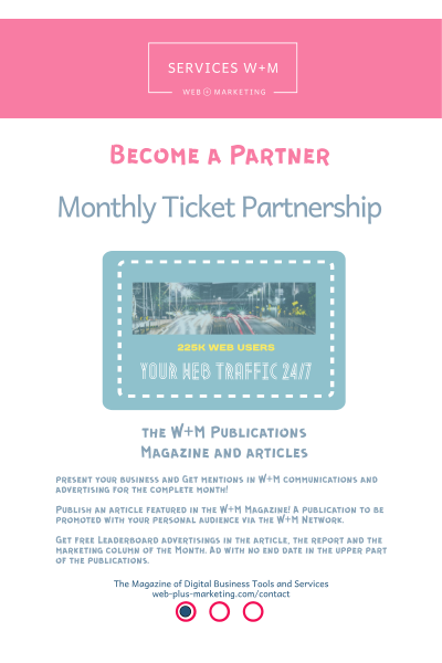
Presentation of Business documents
Introducing a sale document into your administrative procedures will be beneficial. Besides uniform your image and marketing text, it’s easily sent in an email or saved on the web.
Once your documentation is composed, consider putting a printable file directly on a website, so your file has a link to share. Displaying an option to open a PDF is the most common virtual way. This is suitable for workers in agencies and purchasing departments, for example, who need to request budget approval. Having the information before contacting us is often crucial. Moreover, more than half of customers scan the Internet before making a connection now.
This is how W+M works to make sales documents visible and accessible. All users have the material quickly. Effective time management.


Mailing and Social Page Banner
Tell Your Logo Story
Once a few examples have been made and after asking the opinions of those around us, our logo already has a story to tell. Why not use this story to start your company presentation by explaining your colour and branding choices? Add it to your relevant texts and presentation of your company’s values to allow your audience to get to know you better.
Isn’t this a great speech to place in your press release for your branding launch!
The Raspberry Story of the W+M Logo
A Comfort Zone Feeling at Work
When I was young, there were raspberries in the back of my yard. It was also the colour I used the most in my box of coloured pencils. Since then, I have this colour in my kitchen or in the decorative accessories in my place. This raspberry red-pink is my favourite colour. Although I find red to be a difficult shade to work with in web design, I couldn’t put my favourite colour in my logo.
W+M, my parents’ signature on the birthday cards of my youth. Although my mother’s name is Nicole and my father’s name was Marcel, she signed only initials in cards and her N, with her stylish handwriting, looked like a W.
W
+
M
Conclusion
And there you have it; now you know the story of the creation of the W+M logo and the meaning of it all.
I hope you will have a great adventure in creating your logo and as you may have noticed while reading the article, this is not my first experience designing a brand, as I implied in the introduction;)
Let’s end this article by reminding you to take your time in the process of creating an image and logo. Also, you may change your mind or start over a few times. In short, like every marketer and programmer, you will develop patience.
I leave many useful links for more info on different topics about logos and brand.
Thank you for your time,
Jeff
Sources:
1- Article in French about colours in graphism: Tout savoir sur la signification des couleurs from graphiste.com: https://graphiste.com/blog/signification-des-couleurs/
2- Tool to convert colour numbers from Rapid Tables: https://www.rapidtables.com/convert/color/hsl-to-rgb.html
3- Turbologo FAQ, logo design platform: https://turbologo.com/fr/faq
4- (Article in French, 10 design tips) 10 conseils en design de logo pour renforcer la présence de sa marque from the author Aviva M. Cantor for the French Agency 99designs.fr: https://99designs.fr/blog/logo-et-branding/conseils-design-de-logo/
5- How to make a good logo: the dos and don’ts, from Kylie Goldstein for WIX: https://www.wix.com/blog/good-logo-design-tips
Production: W+M Services


Other Blog tickets
Websites - creation, management and design

I edit the content of existing sites via CMS in addition to creating sites with WordPress and Squarespace. I have been producing website content as a webmaster since 1998.
I help companies get their first website up and I improve the performance of existing sites.
Yes, I’m Mr. Analytics and my reaction time to new digital marketing is daily, which allows my clients to have optional and trend-cutting tools.
Follow the content of the marketing blog and participate in the articles by commenting, with respect, on the content of the site, intended for Quebec companies operating in the digital market.
Reports and articles from the Web + Marketing. This is the Top of 2025’s content from the virtual magazine. Subscribe for free and share the experience.